Design expert Quinn Hannum offers tips for creating a customized color palette that evokes positive emotions and gives your home a stunning boost in curb appeal.
/the-ideal-color-for-home-exterior-1a-featured.png?width=900&name=the-ideal-color-for-home-exterior-1a-featured.png "the ideal color for home exterior")
“Emotion.”
That’s the first word that comes to mind when Quinn Hannum contemplates the concept of color. She has traveled the world designing luxury spaces, and if her diverse clients have anything in common, it’s the way they experience color.
“Color is one of the most powerful tools we have to inspire an emotion. Clever use of it can actually enhance our day-to-day lives,” says Quinn, an NCIDQ-certified design professional who started her career working with one of the World’s Top 100 architectural firms before launching her own company.
“Color affects us all psychologically, whether we’re conscious of it or not, and influences our emotional state and which actions we will take as a result of being around those colors. Some help us relax. Some make us feel joyful. Some even make us feel more hungry and impulsive so we eat more! The list of colors and their effect on us goes on. Ultimately, we want to make sure to select colors to surround ourselves with that are an accurate reflection of our personality, and how we aspire to feel.”
In that sense, choosing a color scheme for a home’s exterior is no different than it would be for the interior. Whether you’re looking to paint the entire facade, replace a front door or add new exterior shutters, Step One in Quinn’s design process is to ask yourself, “How do I want to feel when I arrive home?”
“Often clients will say they’d like to feel relaxed, happy, calm, proud, etc.,” Quinn says. “After the dominant emotion is clearly established in their mind, I ask them to visualize the color that corresponds to that emotion for them, personally. This is intuitive for most, and the exercise becomes the starting point for the color palette of their home.”
Going with your gut instinct is a good place to start when choosing an exterior color palette, but it’s just that: a start. To channel your initial emotional reaction into a color scheme that will really work for your home in the long term, Quinn suggests taking all of the following steps.
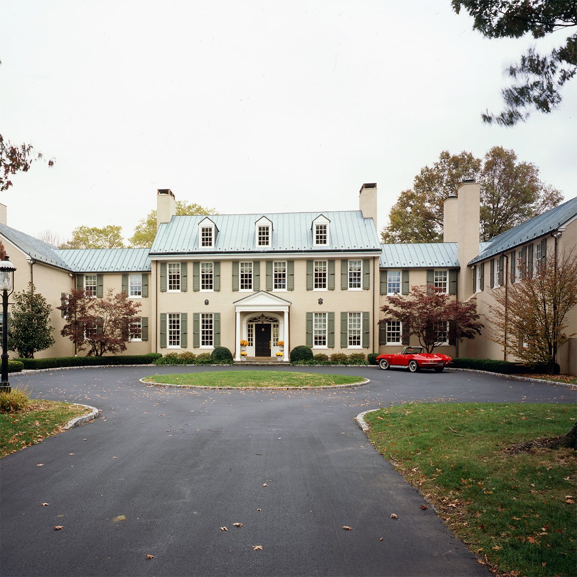
Eliminate The Negative
/picking-the-right-color-for-a-home%E2%80%99s-exterior-2b.png?width=900&name=picking-the-right-color-for-a-home%E2%80%99s-exterior-2b.png "picking the right color for a home’s exterior")
Not sure which color is “right” for your home’s exterior? Identify colors you know are “wrong.”
“Many people are uncertain of what they do want, but most people know exactly what they don’t want,” Quinn says. “Knowing which colors you don’t like is extremely helpful because you can say, ‘Well, I hate green and gray,’ and then you know that green and gray are out. A process of elimination can help you find your way toward the colors that
suit you best.”
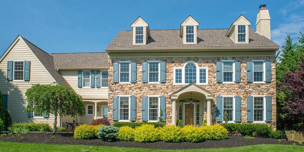
Research Your Style
/style-inspiration-for-a-home%E2%80%99s-exterior-3c.png?width=900&name=style-inspiration-for-a-home%E2%80%99s-exterior-3c.png "style inspiration for a home’s exterior")
Designing the look of your home is similar to getting a new haircut or shopping for a wardrobe. It helps to start with clearly defined style preferences. So, set aside time to look through books, magazines and social media. Collect images of homes that inspire you, then comb through everything you saved to look for an overriding theme.
“If you don’t have a library of design books, it’s OK,” Quinn says. “I love to use Pinterest because it’s so easy to refine your search, and then save and share notated images back and forth with my clients. When I study what they’ve saved, inevitably, there is a repetitive theme in style preferences, and a dominant color emerges. Studying the commonalities informs the right design direction to go in for them. You just have to do a little bit of legwork in the beginning.”
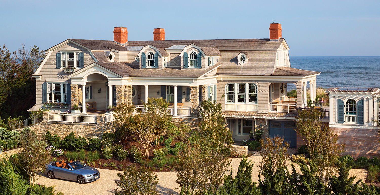
Assess The Environment
/using-landscape-to-pick-a-home%E2%80%99s-exterior-color-4a.png?width=900&name=using-landscape-to-pick-a-home%E2%80%99s-exterior-color-4a.png "using landscape to pick a home’s exterior color")
Once you’ve done some behind-the-scenes preparation, it’s time to get outside and really examine your home. What direction is it facing and how does natural light hit the facade at different times of the day? What is surrounding the home? What other surfaces must be taken into account?
“I always pull out a compass to find out what direction a home is facing because natural light will drastically affect the way we experience a color when it’s applied to the facade of a house.” Quinn says. “For example, if the front of your home faces north it won’t get direct sunlight, so a color may look great on the color chip, but once it’s applied to the
facade, chances are high that it will look more somber. If you’re facing south, you get direct sunlight all day, so if something looks perfect on a chip, you have to keep in mind that it will look far more vibrant on your facade. In this case, it’s wise to select a few additional samples which are more toned down, but in the same color vein, to achieve
the desired effect.”
In addition to sunlight, Quinn also recommends taking your roof, landscaping, and hardscaping into account before selecting an exterior color for the house.
“I always note the color and material of the roof, walkways, driveway, property fences, and any facade material that will not be painted, such as natural stone or brick, because they can be great places to pull color cues from,” she says. “Every individual element needs to support the next. I also look for inspiration from the plants around the property because
I want to make sure the paint choices are complementary to the color of the flowers and foliage. You want the home to serve as a beautiful backdrop to enhance the landscaping, and vice versa, rather than compete with each other.”
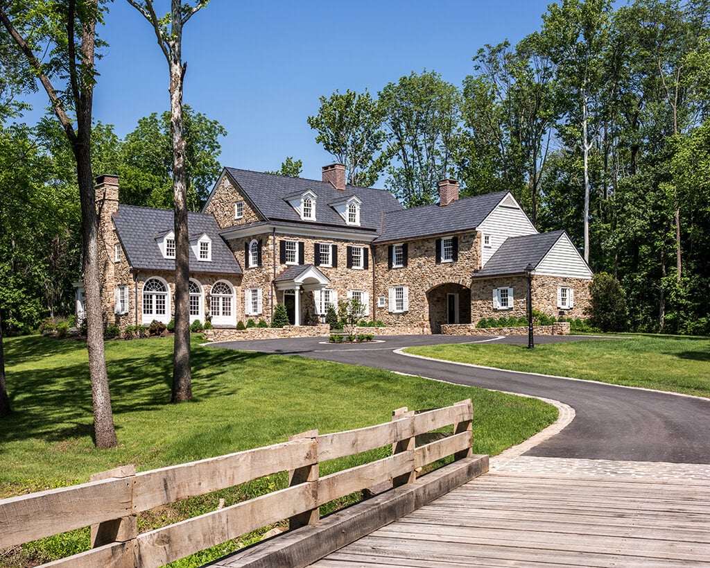
Test It Out
/testing%20colors%20for%20a%20home%E2%80%99s%20exterior-5a.png?width=900&name=testing%20colors%20for%20a%20home%E2%80%99s%20exterior-5a.png "testing colors for a home’s exterior")
No matter how much you love a color, do not just pick up a sample, hand it to your painter and turn them loose on your home’s entire exterior. Instead, take a day or two to test how the color will actually look as light hits it from different angles.
“When someone is looking at a small color chip, it can be very misleading,” Quinn says. “It may look perfect at that scale, but when you blow it up to the scale of your home, your opinion of that color may drastically change, and it often does. So my tip to everyone when they’re trying to decide on a color for an exterior, is narrow down your small swatches to a few of your favorites, and always, always, always do tests in a large square space — of at least 2 feet by 2 feet — on the actual vertical surface the paint is going on, so they can step back and look at those colors — not once, but at least three times throughout the day before they make their final call.
“Looking at those large samples in the morning, mid-day, and late afternoon and noting your favorite will help you choose the right color. If you have a single family house, do tests on multiple sides of your home and walk around. Take a look at the backyard and the side yards. By doing this simple exercise and spending a few dollars on a pint [of paint] for color testing, you’re saving yourself thousands of dollars on a big mistake later on.”
Have Fun!
/how%20to%20choose%20an%20exterior%20color%20palette-6a.png?width=900&name=how%20to%20choose%20an%20exterior%20color%20palette-6a.png "how to choose an exterior color palette")
Conventional wisdom is to take a three-pronged approach to exterior colors: start with a dominant field color, then add a secondary trim color and a tertiary color for accents, like doors and exterior shutters, to complete the look.
While blueprints are certainly useful, Quinn says there’s no such thing as a hard-and-fast rule when it comes to selecting colors. If you test out a particular palette that seems “outside the box,” but it feels right to you, that’s all that counts in the end.
“Let the architecture guide you first, and your personality guide you second,” Quinn says. “If you have wonderful existing architectural details and textures, it can be nice to keep things more subtle, in order to celebrate and not distract from those details. You want to play up the most beautiful aspects of your home, so identify them, and direct the attention and focus to those places. Use your personality, the emotion you want to feel, and your gathered resources as guides. These days, people are having a lot more fun doing things that are a reflection of their personal style, versus following trends.”
What Are the Best Exterior Colors For 2021?
/the%20best%20exterior%20colors%20for%202021-7b.png?width=900&name=the%20best%20exterior%20colors%20for%202021-7b.png "the best exterior colors for 2021")
Speaking of trends...throughout her design career, Quinn has always been ahead of the curve when it comes to the next big color craze. What does she think the second half of 2021 might have in store?
“It’s an interesting world that we’re living in post-COVID,” she says. “Most people are just starting to resurface and recover from the year and a half of emotional exhaustion that we just went through. The overwhelming theme I anticipate as people reassess the design of their homes, is that they will want to feel grounded, in a calm, positive and peaceful environment, so, you’ll see clean colors that nurture and inspire those emotions.”
Here are some of Quinn’s specific picks for the best exterior colors of 2021:
- Various shades of warm neutrals, blues, greens and deep plum browns — like Wimborne White, Snow White, Vert De Terre, Ball Green, Green Smoke, Light Blue, Inchyra Blue, Brinjal, and Tanner’s Brown by Farrow & Ball.
- A putty-tone neutral that serves as a base for other colors to rest against — like Off-White, Old-White, Skimmed Milk White, Bone, and Sand by Farrow & Ball.
- The return of plaster textures, lime washes, and wabi-sabi sensibilities, from the design of the interiors to exteriors and gardens.
Ready to start designing your ideal home exterior? Find inspiration in our photo gallery, filled with images of beautiful homes that span the color spectrum and showcase a variety of architectural styles.
Keep checking our blog page for more of Quinn’s expert tips; next time, we’ll discuss her ideas for creating the perfect outdoor space!
About Quinn Hannum
/design%20expert%20quinn%20hannum-8.png?width=300&name=design%20expert%20quinn%20hannum-8.png "design expert quinn hannum") After beginning her career in Europe, and later joining a World’s Top 100 Architectural Firm in Manhattan where she designed exclusive residential and commercial development projects, Quinn Hannum launched her own interior architecture and design company, serving clientele in New York City and The Hamptons. Now, Quinn is bringing her international expertise and love of the finest materials and artisan craftsmanship to Philadelphia.
After beginning her career in Europe, and later joining a World’s Top 100 Architectural Firm in Manhattan where she designed exclusive residential and commercial development projects, Quinn Hannum launched her own interior architecture and design company, serving clientele in New York City and The Hamptons. Now, Quinn is bringing her international expertise and love of the finest materials and artisan craftsmanship to Philadelphia.
Quinn’s thoughtful and intuitive design approach begins with defining well-planned architectural spaces and details that anticipate clients’ needs and wants before they even know they have them. Her services expand to include luxurious lighting layouts, fine art curation, intimate landscapes for the city and suburbs, and custom furniture designs and built-ins, which feature precious techniques, such as chinoiserie lacquer art, marquetry inlay, specialty metal finishes and rare stone selections. To add a chic element of the unexpected, Quinn organizes shopping excursions to Paris with her clients, to visit ateliers and the famous Marché aux Puces, which is the destination for unfathomably beautiful artwork, lighting, antiques, furniture, fabrics and decorative relics with a story.
Quinn credits the success of her innovative and sophisticated style to her collaborations with the most highly respected artisans, ateliers and galleries throughout Europe and The United States, some of whom create pieces for luxury brands like Cartier, and the homes of A-list celebrities and international royalty. Together, Quinn and the artisans elaborate over the perfect finishes, proportions, accents, and comfort level of each piece they create, all of which are tailor-made to suit each client.
For inquiries, please visit www.QuinnHannum.com and follow on Facebook and Instagram.