Design expert Quinn Hannum shares some simple, yet impactful ways to create extraordinary experiences, both inside and outside your home.
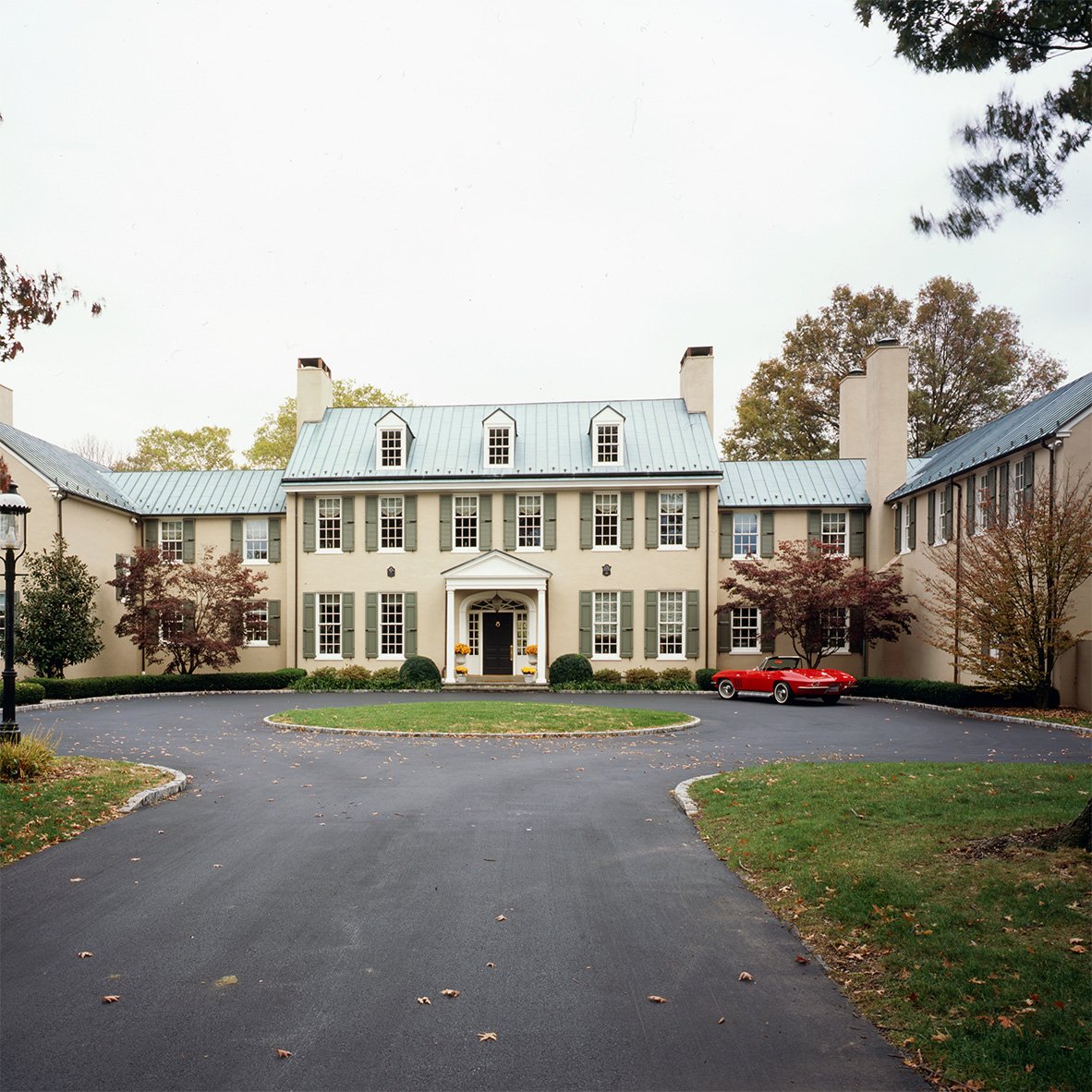
/tan-home-with-khaki-louver-shutters-1.png?width=900&name=tan-home-with-khaki-louver-shutters-1.png "tan home with khaki louver shutters")
Like an artist with an array of paints and brushes, or a craftsman with lathes, saws, and drills, a designer brings their own set of tools to a project. There are seven design elements and five design principles, all with the potential to work magic on a space. The trick is to know what to use, where, and how.
Does that sound complicated? It doesn’t have to be!
Quinn Hannum has mastered this formula while traveling the globe, designing luxury interiors and landscapes for clients far and wide. Here, she opens her toolbox to reveal six key facets of high-level design that any homeowner can utilize to dramatically enhance their space.
They are:
- Emphasis
- Movement
- Balance
- Repetition
- Texture
“Out of all of the design elements and principles, these six make a big impact and they’re also relatively easy to implement,” says Quinn, founder of Quinn Hannum Luxury Interiors, Gardens & Furniture. “Applying these design principles and elements will create a noticeable difference and make your space feel more beautiful and interesting.” Explore each section below and awaken your inner design expert!
1. Emphasis
/water-fountain-centerfold-in-garden-2.png?width=900&name=water-fountain-centerfold-in-garden-2.png "water fountain centerfold in garden")
Establishing a focal point in a space is designing with emphasis. You’re emphasizing one particular piece that you want to grab people’s attention as soon as they enter a space or approach your home.
“It could be a piece of art, a sculpture, an architectural element, a piece of furniture that’s really interesting, a water feature, a light fixture, or an exterior detail on the facade of a home,” Quinn says. “When I’m designing a space, I ask myself, ‘What is it that I want people to notice first? And then from there, I shape the rest of the design around supporting that piece, so it maintains impact.”
Why is emphasis so important?
“It’s a way of creating a sense of place,” Quinn says. “When you enter a space, you should have something that captures your attention, that is beautiful, and invites you to come further into the space.”
How can you design with emphasis? Quinn has three suggestions: Elevate, illuminate and differentiate your focal point.
“If you have a beautiful sculpture, and you want the emphasis to be on that sculpture,” she says. “You could elevate it on a pedestal, and you could illuminate it with lighting to create more emphasis on it. You could also keep the color palette around that piece more subtle and monochromatic so that no other colors detract attention from that piece. By doing these things, you’re creating emphasis on the sculpture and you’re also increasing the visual interest of the space. Emphasis can be on anything you want, but you just have to make a conscious decision about what it is that you want to emphasize and make sure your design choices around it, support that decision.”
2. Movement
/pavers-walkway-design-with-landscaping-3.png?width=900&name=pavers-walkway-design-with-landscaping-3.png "extravagant pavers walkway design with neatly trimmed landscaping")
Movement refers to the way the eye travels around, or “reads,” a space or a particular object. As a designer, Quinn’s goal is to map out an intriguing journey for the eye throughout a space. She wants every person who enters to feel compelled to stay and look and a little while longer.
“Movement is all about maintaining the viewer’s attention and asking their eyes to go on a journey around your space, instead of just glancing quickly and moving on,” she says. “For most of us in the western world, we are inclined to read a space from left to right because that’s actually how we read a page in a book, so it’s helpful to keep that in mind when planning.”
To create movement in a design, it is helpful to sketch out a map. She says you can think of a play for a football game that shows the intent for how the players will move across the field, only instead of players on a field, you’ll be mapping out how a viewer’s eyes will scan the space you’re designing.
“I make a list, and it starts with organizing the most important element, leading to the next most important, and the next most important, and so on. I consciously say that I want the attention to go here first, and then here, and then here,” she says. “You’re intentionally guiding an experience, and you do that through placement, color choice, shape, lighting, etc.”
Changes in levels play a huge role in movement because they ask the eye to move up and down. Whether you’re designing an interior or exterior space, you can use furniture, lighting fixtures, plants, stairs, and pathways to create changes in level in your design.
“Imagine walking into a room filled with desks and nothing else; your eye would quickly lose interest because the furniture is all at the same height. There’s nothing asking your eye to keep moving. The same goes for a room lit solely by recessed lights. Your mind says, ‘OK, I’ve seen it. I’m done,’ in one second. But, if you walk into a space and you have overhead lighting and sconces, floor lamps, uplighting on trees, candles on a table and maybe some shelving that goes from floor to ceiling, and other architectural elements that are going from floor to ceiling on the walls around you… Then, there are different levels being activated, and THAT makes the space so much more interesting. It takes you a while to actually look at all of the elements in a room with more activated levels between the floor and the ceiling,” Quinn says.
The same principle applies to landscape design. Short, direct pathways don’t spark nearly as much curiosity — or require nearly as much energy to look at — as indirect, winding paths.
“One of the best ways to get movement in an exterior design is to creatively think about how you want the paths to meander through your space,” Quinn says. “It doesn’t take much time for your eye to go down a straight path, but if you have a meandering path or a path that opens into a square courtyard and goes around a central focal point...that’s also very interesting. That’s movement in an exterior design.”
3. Balance
/main-entrance-to-elegant-luxury-building-4.png?width=900&name=main-entrance-to-elegant-luxury-building-4.png "main entrance to elegant luxury building")
Every element in a design carries some visual “weight,” and that weight comes from factors like color, shape, size, and pattern. For example, if you had two balls of the same size, but one was black and the other was white, the black one would seem heavier. If you had an upholstery fabric with a larger-scale pattern, it would seem heavier than one with a smaller-scale pattern.
“It’s the arrangement of the various elements within a space that when arranged well, achieves balance,” Quinn says. “You can either decide to do something completely symmetrical, where you have an imaginary line that goes down through the center of the design and you lay out all the elements exactly the same way on either side of that imaginary line. Or asymmetrically, where your imaginary line is not in the center and it’s up to the designer to arrange the elements on either side of that line in a way that it feels balanced because they are carrying the same amount of visual weight.”
When it comes to exterior design, certain architectural styles place more emphasis on symmetry and balance. Picture an old Colonial home with a central doorway and a completely symmetrical window layout on either side, all flanked with louvered shutters. Others, like modern homes from the 60’s feature more asymmetrical exteriors, which can require more thought and planning to strike a good balance.
“It takes playing around with the elements to really strike the right balance, and there are so many ways to do that,” Quinn says. “It’s visual, which can be a little tricky, but we all have an instinctive ability to look at things and know when it feels right or a little ‘off.’ So, balance is one of the things that I think many of us can implement, just by paying attention to the concepts of balance and symmetry. Doing this can significantly improve the quality of your space.”
4. Repetition
/hallway-lined-with-columns-5.png?width=900&name=hallway-lined-with-columns-5.png "hallway lined with columns")
Repetition is straightforward and simple — and that’s what Quinn likes the most about it.
“This is one of the oldest design principles (think of a Greek colonnade), and it’s one of my favorites because it’s a great way to create visual interest without being fussy,” Quinn says. “You could create repetition by simply repeating the same shape and color over and over again. So, it’s easy to do and beautiful to look at. It has a high design impact.”
Here are a few of Quinn’s suggestions for utilizing repetition to add style and flair to a space:
- Planting the same kind of tree, one equidistant from the next, on either side of a driveway.
- Planting the same kind of boxwood topiary around the perimeter of a garden to create both repetition and a sense of unity.
- Decorating an exterior dining table with a line of small pots and succulents down the center of the table.
- Accenting all the windows along the face of a building with identical shutters.
- Adding wooden privacy screens to an outdoor space or garden. One simple way to create a screen is to hang three or four Bermuda shutters from a pergola to provide shade from the sun and create a beautiful backdrop for the space.
There’s no shortage of options when it comes to utilizing repetition within your space. Whatever you do, it’s bound to be fun.
“Repetition is clever,” Quinn says. “It’s such an easy thing that you can do that requires little effort on your part but it ends up looking really chic and sophisticated.”
5. Texture
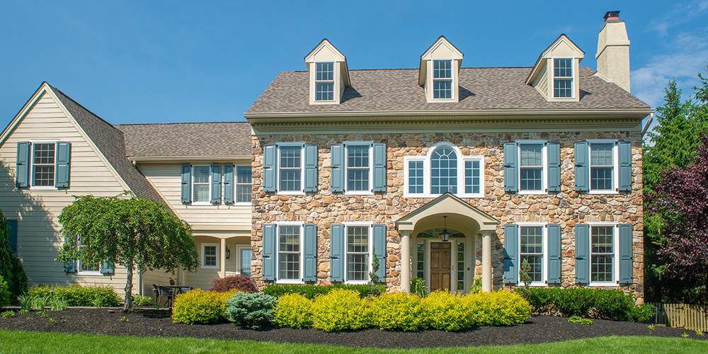
/stone-home-blue-combination-exterior-shutters-6.png?width=900&name=stone-home-blue-combination-exterior-shutters-6.png "stone home with blue combination exterior shutters")
Texture is defined as the surface quality of a material, perceived either directly by touch or indirectly by the eye. Descriptions of texture could be smooth, soft, rough, matte, polished, woven or shiny, etc.
For simplicity, when assessing texture in a design, Quinn breaks it down into two categories: wet and dry.
“Wet textures are typically smoother, and they reflect light,” Quinn says. “Think of a mirror finish when visualizing wet texture. Dry textures absorb more light than they reflect. Think suede. The key to using texture in a design is to strike a balance between wet and dry. Too many mirrored finishes, for example, could make a person feel overwhelmed in a space, rather than cozy and comfortable. On the flip side, too many dry textures could make a person feel suffocated, and leave your space feeling drab and boring,” Quinn says. “The goal is to bounce a little bit of light around the space with wet texture, to create visual interest and keep the eye moving, but you also want to balance it out with the depth that dry textures give, in order to create a sense of relaxation with a touch of glamour, both visually and physically.”
“In outdoor spaces,” Quinn says, “water features, glass, shiny metal, glossy paint finishes, and glossy plant leaves typically provide the wet texture, while natural wood, stone, brick, fabric, and other paving materials provide the dry texture.”
Take, for example, the home in the photo below. The window glass, glossy paint finish on the exterior shutters, and glossy plant leaves are balanced by the dry texture of the brick facade and walkway. It’s visually appealing because this is balanced texture.
Home Design Tips You Can Use Today
/red-brick-home-black-timberlane-panel-shutters-7.png?width=900&name=red-brick-home-black-timberlane-panel-shutters-7.png "red brick home with black Timberlane panel shutters")
Now that you have five big-impact design tools in your arsenal, it’s time to choose which ones make the most sense for your home. All of these elements and principles are sure to elevate a space in short order, but they don’t all have to work together at once. You have the freedom and flexibility to pick what’s right for your life and your particular project. “The principles and elements you choose to implement could depend on the way you live and the things you own,” Quinn says. “Certain ones make sense for certain people. If you’re a traditionalist, symmetry, balance, repetition, and emphasis are going to make a lot of sense, because those elements and principles are prominent in classical design. If you’re a modernist, asymmetrical balance, movement and texture could come more into play.”
Identify your style, your goals, your budget, and the requirements of your project. Then, let loose and have some fun with these design tools!
About Quinn Hannum
/design%20expert%20quinn%20hannum-8.png?width=300&name=design%20expert%20quinn%20hannum-8.png "design expert quinn hannum") After beginning her career in Europe, and later joining a World’s Top 100 Architectural Firm in Manhattan where she designed exclusive residential and commercial development projects, Quinn Hannum launched her own interior architecture and design company, serving clientele in New York City and The Hamptons. Now, Quinn is bringing her international expertise and love of the finest materials and artisan craftsmanship to Philadelphia.
After beginning her career in Europe, and later joining a World’s Top 100 Architectural Firm in Manhattan where she designed exclusive residential and commercial development projects, Quinn Hannum launched her own interior architecture and design company, serving clientele in New York City and The Hamptons. Now, Quinn is bringing her international expertise and love of the finest materials and artisan craftsmanship to Philadelphia.
Quinn’s thoughtful and intuitive design approach begins with defining well-planned architectural spaces and details that anticipate clients’ needs and wants before they even know they have them. Her services expand to include luxurious lighting layouts, fine art curation, intimate landscapes for the city and suburbs, and custom furniture designs and built-ins, which feature precious techniques, such as chinoiserie lacquer art, marquetry inlay, specialty metal finishes and rare stone selections. To add a chic element of the unexpected, Quinn organizes shopping excursions to Paris with her clients, to visit ateliers and the famous Marché aux Puces, which is the destination for unfathomably beautiful artwork, lighting, antiques, furniture, fabrics and decorative relics with a story.
Quinn credits the success of her innovative and sophisticated style to her collaborations with the most highly respected artisans, ateliers and galleries throughout Europe and The United States, some of whom create pieces for luxury brands like Cartier, and the homes of A-list celebrities and international royalty. Together, Quinn and the artisans elaborate over the perfect finishes, proportions, accents, and comfort level of each piece they create, all of which are tailor-made to suit each client.
For inquiries, please visit www.QuinnHannum.com and follow on Facebook and Instagram. For client testimonials and other great video content, subscribe to Quinn’s YouTube channel.